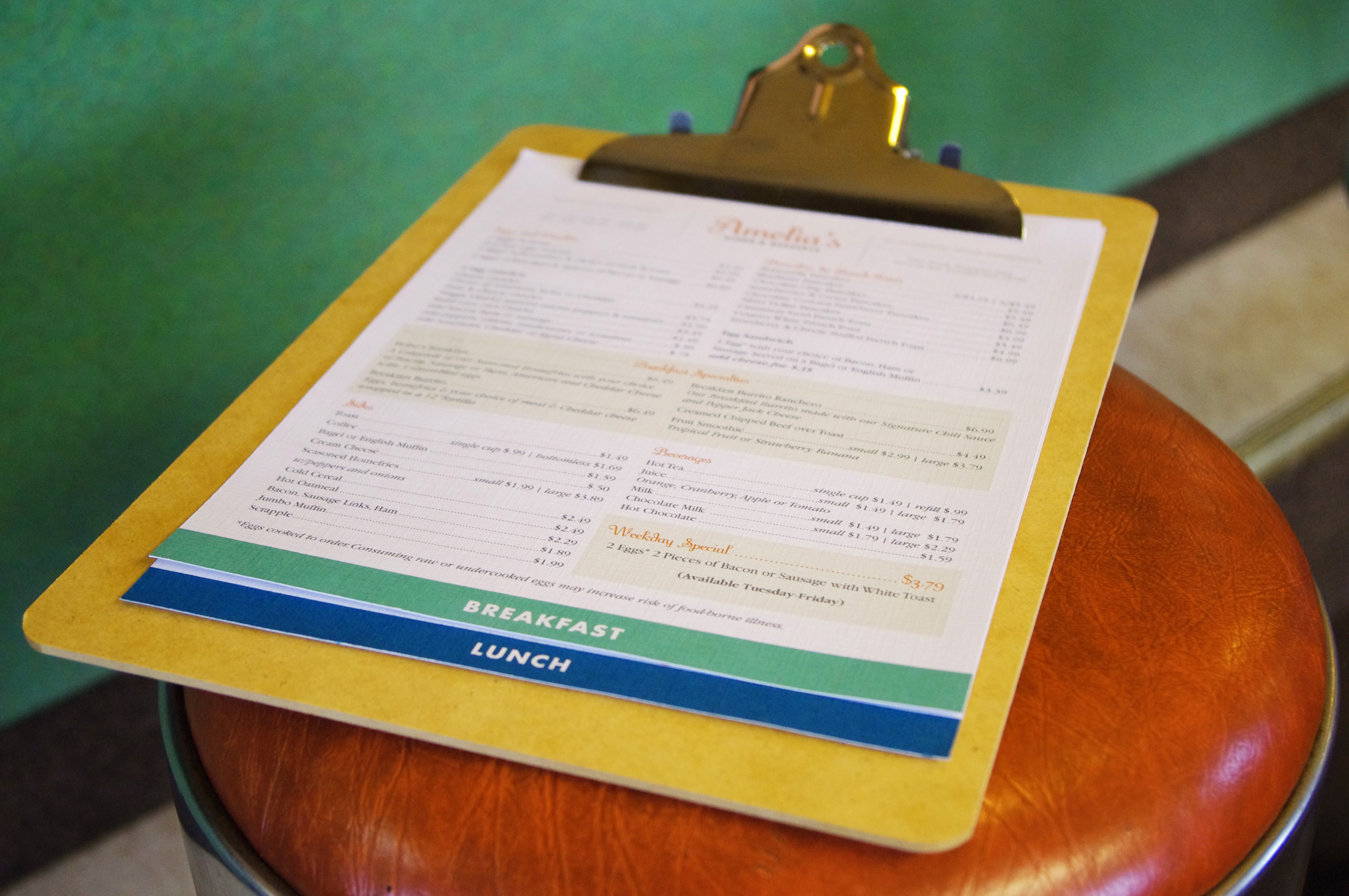
Amelia’s Diner has the best breakfast in the Back Mountain and lunch that will knock your socks off. The retro vibe and friendly demeanor make you want to sit back, relax and eat dessert first. Go on, do it. You deserve it.
Challenge
Since re-opening an old diner under a new name and new ownership, Amelia’s owners aimed to give the place a facelift while maintaining the retro diner vibe that NEPA locals know and love. The reputation of the previous business was inconsistent. It boasted some die-hard regulars who were reluctant about a change of any kind, but there were also lifelong Back Mountain residents who had never even heard of the place. The new brand needed to convey a fresh twist on a reliable and consistent product and service.
Solution
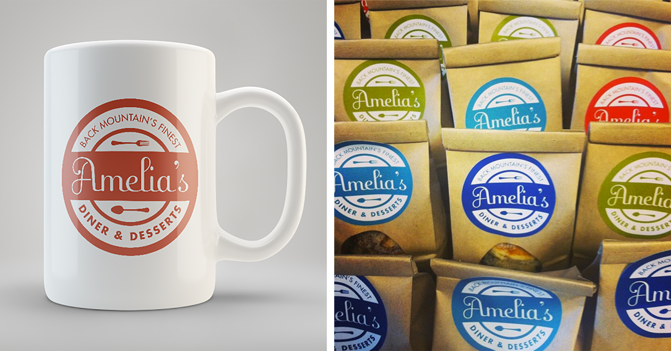
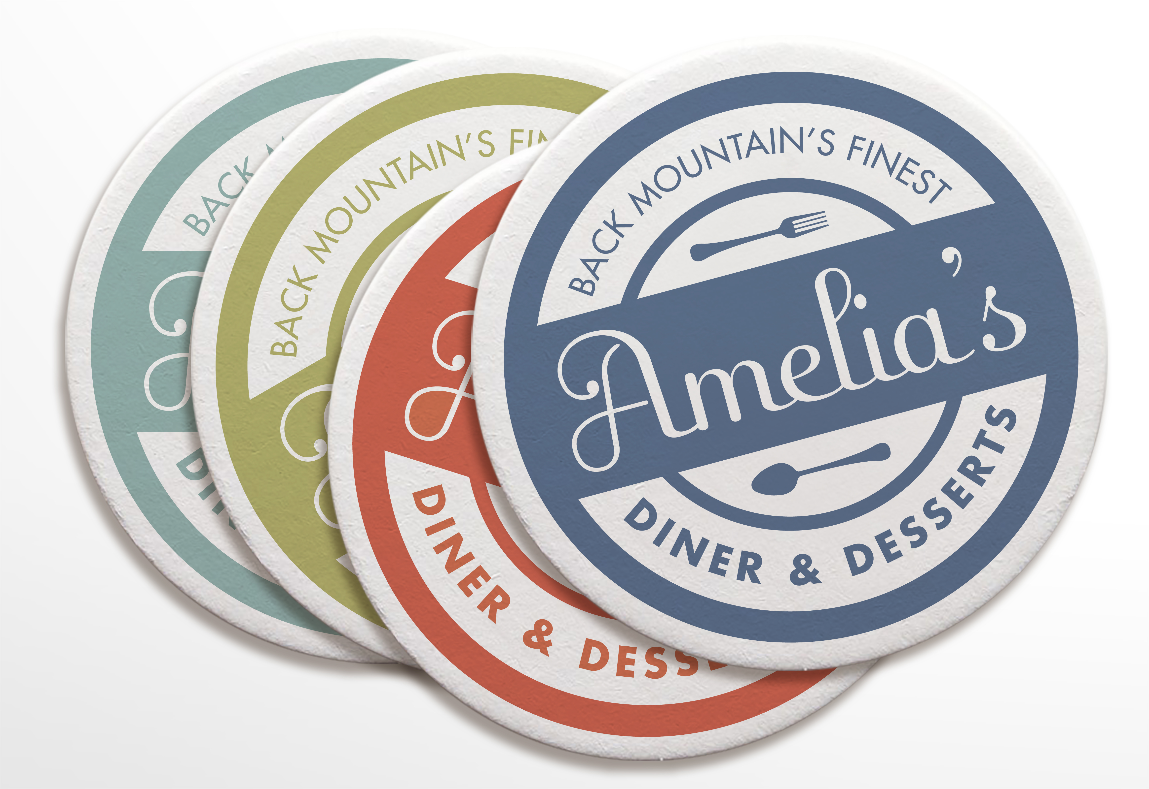
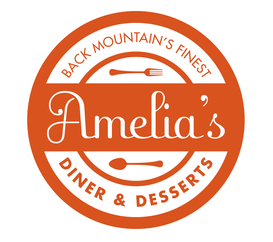
The Amelia’s Diner Brand Identity pulls inspiration from classic americana style with a flirty, retro script typestyle paired with a hardworking sans-serif (Futura Bold) and kitschy utensil illustrations and patterns. Having a consistent message and image has helped Amelia’s reach their dream customers by knowing who they are and providing an environment where they feel comfortable. And also, coffee.

